Welcome Back to Win-Win Democracy
This issue continues and completes our discussion of achieving win-win solutions to problems in voting. Our focus this time is on developing a win-win approach to controlling partisan gerrymandering.
If you want a refresh on what gerrymandering is and why it is helping to destroy our democracy, (re) read the first issue of the newsletter:
Gerrymandering, well done using modern computing and data analysis, almost completely pre-determines the outcome of multi-district elections. Court battles over gerrymandering have been raging for years and are ongoing, with Republicans trying to overturn Democratic gerrymanders and Democrats trying to overturn Republican gerrymanders. Meanwhile, voters lose.
A Request for Help: A newsletter like this will work best with participants holding a variety of opinions on important issues. Most of my friends lean left, so many of the initial subscribers lean left. If you have friends or relatives who lean right, please encourage them to subscribe and participate.
How to Gerrymander
Let’s say that you’re drawing maps to advantage your party. You sit at a computer with maps, population data from the census, and historical election data by precinct1. Since voters’ party preferences change gradually, precinct behavior over past elections is a reasonable predictor of precinct behavior in upcoming elections.
Packing and Cracking
You use the data to construct districts from precincts in a way that helps your party. The two key techniques are “packing” and “cracking”.
A word about terminology: To refer to a precinct that tends to elect Democratic candidates, I’ll say “Democratic precinct.” Likewise for “Republican precinct.” Understand that I’m referring to how voters vote, not to their party affiliations when they registered to vote. Similarly, I’ll say “Democratic vote” to refer to a vote for a Democratic candidate, regardless of the registered party affiliation of the voter. Likewise for “Republican vote.”
Let’s say that you’re a Republican. You want to “pack” as many Democratic precincts into as few districts as possible subject to the constraint that districts must roughly be equal population, geographically contiguous, etc.2 The idea of packing is to waste a lot of Democratic votes winning a small number of safe-for-Democrats districts.
Then, you “crack” the remaining Democratic precincts — across a larger number of safe-for-Republican districts. These Democratic votes will be swamped by Republican votes and hence have no impact. Depending on the details, you might have a few districts that are almost competitive but lean Republican.
Example: 2018 NC US House Districts
Here’s an example3. For this race, there were 13 Congressional districts defined by a Republican-controlled redistricting process. Here’s the election’s outcome:
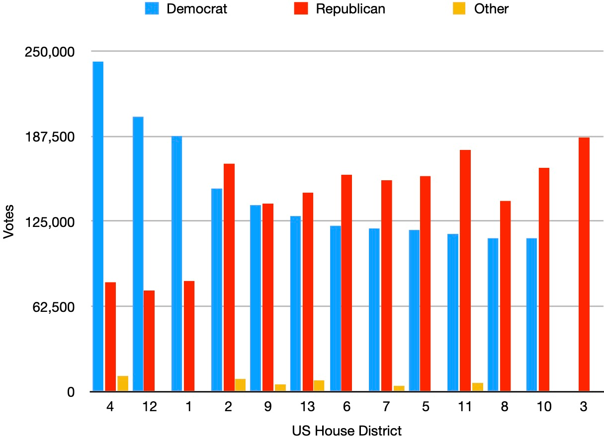
Statewide, 50.5% of votes were cast for Republican candidates and 48.2% for Democratic candidates, resulting in 10 Republican representatives and 3 Democratic representatives. You can see the effect of packing in districts 4, 12, and 1, where the Democratic candidate won by huge margins, effectively wasting many (23%) of the statewide Democratic votes in these districts. Cracking of the remaining Democratic precincts across the other districts completed the gerrymander.
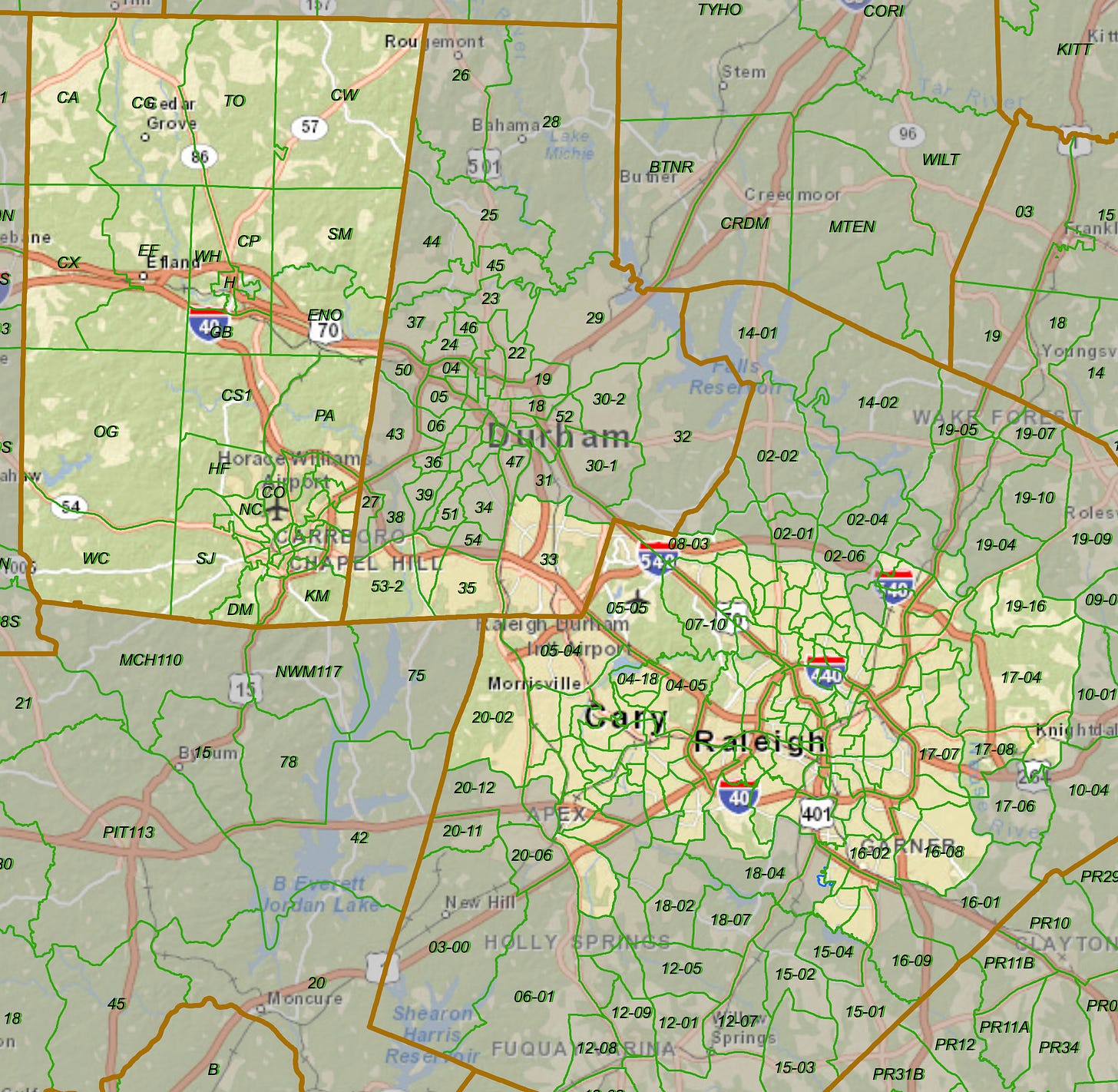
To get a sense of the contortions done to achieve this, here’s a map of district 4 (light color) with the boundaries of Orange County, Durham County, and Wake County shown in solid brown. The district includes all of Orange County and the heavily Democratic areas of Wake County surrounding Raleigh and Cary, connected by a thin sliver along the southern boundary of Durham County.
Please remember: Democrats gerrymander too. Take a look at New York, Illinois, and Maryland for examples.
Getting it Done
Effective gerrymandering used to be difficult because the necessary data comes in different formats from various government agencies. But these days, computer software makes this straightforward. There’s a Redistricting Data Hub, which makes extensive data available in common formats; and Dave’s Redistricting App (DRA) is freely-available software, which anyone can use to experiment with creating redistricting maps.
Reforming Redistricting
There have been many attempts to reduce gerrymandering by taking map drawing out of the hands of the politicians who benefit from gerrymandering. Some states now use commissions to create district maps, with commission members appointed by legislative leaders and/or governors or selected from citizen volunteers and civil servants. In some states, the commission’s work is subject to approval by the legislature or a court. For full detail, see the organization FairVote’s state-by-state information on who draws Congressional and State Legislative maps.
Some commissions have been able to reduce gerrymandering. Others have themselves become populated with intensely partisan members, who are unable or unwilling to do better than their state legislatures did previously. Some commissions have been deadlocked, kicking the task back to the legislature or to courts.
There have also been suits questioning the constitutionality of independent commissions. After Arizona voters created an independent commission via a ballot initiative, the Arizona Legislature in 2012 sued the Arizona Independent Redistricting Commission. In a 5-4 decision, the US Supreme Court affirmed the US District Court’s rejection of the legislature’s complaint, allowing the independent commission to continue its work. With the Court’s recent conservative shift, it is unclear how the Court would rule on a similar suit today.
Independent commissions have been less successful at reducing gerrymandering than hoped.
When Is a Map a Partisan Gerrymander?
Instead of reforming the process of creating maps, can we tackle the problem head on and answer the fundamental question: What constitutes an unacceptable partisan gerrymander?
The situation is a bit like Supreme Court Justice Potter Stewart’s famous expression regarding hard-core pornography: “I know it when I see it.”
Intuitively, something seems amiss with a result like I described above, in which a state where Democratic and Republican votes were cast in almost equal numbers is represented in Congress by 10 Republicans and 3 Democrats. But should it be 7 Republicans and 6 Democrats, or 8 and 5, or 6 and 7, or what?
Odd-shaped districts like district 4 above raise suspicion of partisan bias. But lack of oddly-shaped districts doesn’t guarantee that a map is unbiased?
Similarly, criteria like compactness (avoiding meandering skinny districts) and respecting natural and political boundaries may be helpful, but they don’t answer the fundamental question.
We need a direct, quantitative answer to the question.
Quantifying Gerrymandering
Fortunately, over the last decade, teams of mathematicians, statisticians, and computer scientists have made substantial progress on quantifying gerrymandering.4 Can our political system can deal with math and computers?
Mathematical Evidence Has Been Accepted by Courts
The encouraging sign is that arguments based on these approaches have been effective in convincing courts, including the US Supreme Court, that excessive partisanship has occurred. Nevertheless, the Supreme Court decided in Rucho v. Common Cause that this is not a problem to be solved by the federal judiciary. As Justice Roberts wrote in his opinion for the majority (page 30),
Excessive partisanship in districting leads to results that reasonably seem unjust. But the fact that such gerrymandering is “incompatible with democratic principles” … does not mean that the solution lies with the federal judiciary.
What SCOTUS was unwilling to tackle, the North Carolina Supreme Court did tackle, ruling 4-3 last month that the new district maps drawn by North Carolina’s Republican-controlled legislature violate the North Carolina Constitution’s free elections, equal protection, free speech, and freedom of assembly clauses. Under the Court’s order, new maps have been drawn.
Reading the Court’s decision, it is clear that the mathematical evidence presented by expert witnesses was the crucial factor in allowing the Court’s majority to conclude that intentional, unacceptable, partisan gerrymandering had occurred.
The Ensemble Method
I’m going to describe a method of quantifying gerrymandering developed by a team led by Prof. Jonathan Mattingly, chair of the mathematics department at Duke University. Prof. Mattingly has been an expert witness in the cases I’ve described and in cases in other states.
Reading for the Mathematically-Inclined
Although I will give a high-level overview, I urge mathematically-inclined readers to also read the team’s work:
Ensembles and Outliers. High-level, relatively accessible description of the method, with example applications.
Posts on the Quantifying Gerrymandering web site. Different topics, organized chronologically in response to events.
Quantifying Gerrymandering in North Carolina. Journal paper describing the approach used in the Rucho v. Common Cause case.
Methods used to Analyze 2020 North Carolina State Congressional Redistricting Landscape and Analysis of the Geopolitical Landscape for the 2020 North Carolina Congressional Districts. Recent analyses of the North Carolina maps drawn after the 2020 census.
Reader’s Guide. Guide to further reading.
Ensembles of Maps
The method determines whether or not a proposed map exhibits extreme statistical characteristics compared with a large collection of maps (20-100 thousand), called an ensemble. Maps in the ensemble meet a state’s legal criteria (e.g., equal population in districts, contiguous, compact, Voting Rights Act compliance). The ensemble is generated by a computer program that implements a well-established technique called a Markov Chain Monte Carlo algorithm. There are many important details to how this is done than don’t concern us here; we just need to know that we have an ensemble of maps that are a representative sample of all possible maps that meet the legal criteria.
The next step is to look at the partisan makeup of the elected representatives based on hypothetical elections using each map from the ensemble and voting data from a past election. For each district in the map, we calculate the percentage of Democratic votes. (It makes no difference which party’s vote percentage we choose.)
To make this concrete, suppose we are analyzing the maps used in the 2018 Congressional election discussed above. So, we have 13 Congressional districts in each map. The result of each hypothetical election gives us 13 numbers, each the percentage of Democratic votes in a district.
We’re going to want to compare how the most-Republican district in the proposed map compares to the most-Republican district in each map in the ensemble, and how the second-most Republican district in the proposed map compares to the second-most Republican district in each map in the ensemble, and so forth. We can do this easily by sorting the 13 numbers for each map in increasing order (i.e., most Republican to least Republican).
Using Histograms to Understand Particular Maps Compared to the Ensemble
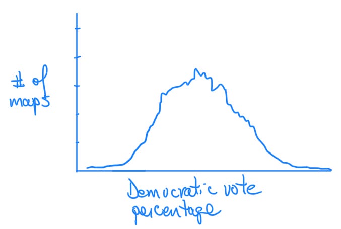
We can then draw for each of the 13 districts a histogram that shows the range of Democratic percentages for that district across all of the maps in the ensemble. It would look something like this (schematic view — not real data):
For any given Democratic vote percentage the histogram tells you how many maps in the ensemble yield that percentage. A histogram shaped like this would show us that maps yielding an extremely high or extremely low Democratic percentage for this district are rare in the ensemble; maps that yield middle values are common.
Remember that we do this for each of the 13 districts. Here’s real data from a critique of North Carolina’s Congressional districts, with the histogram for each district plotted rotated 90 degrees:
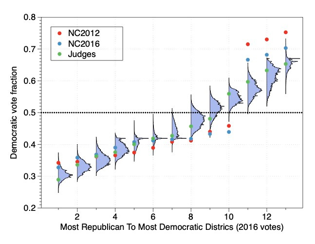
The ensemble consists of 24,000 maps created by the Markov Chain Monte Carlo algorithm. Using votes from the 2016 election, each histogram shows how frequently the districts in the ensemble yielded particular Democratic vote fractions. The colored dots show the actual fractions achieved with three specific maps:
Red: the map used in the 2012 election
Blue: the map used in the 2016 election
Green: a map drawn by a bipartisan group of retired judges as part of an effort to demonstrate the benefits of maps drawn by a (hypothetical) independent commission.
Let’s discuss some characteristics of this graph:
With the judges’ map (green dots), the Democratic vote fraction increases smoothly from most-Republican to most-Democratic districts. With the actual maps used in the elections (red and green dots), there are sudden jumps in the Democratic vote fractions, showing the effect of packing.
In the 2012 (red dots) and 2016 maps (blue dots), the sixth through tenth most-Republican districts show an unusually large number of Republican votes compared to the maps in the ensemble. The judges’ map does not have this problem.
Similarly, with the 2012 and 2016 maps, the 11th to 13th most-Republican districts show an overabundance of Democratic votes.
Probability of Given Number of Democrats Elected
We can also see the impact of the 2012 and 2016 maps by looking at the probability of a given number of Democratic wins across all of the maps in the ensemble and noting where the 2012, 2016, and judges maps are situated:
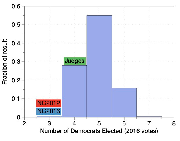
The results of the 2012 and 2016 maps are extremely unlikely across the entire ensemble.
Using Box Plots to Understand Anomalous Maps
Let’s revisit the histograms of each of the districts across the ensemble. While the histograms give a detailed view of the behavior of the districts across the ensemble, it can be difficult to tell whether or how much a particular map is anomalous.
Statisticians often use box plots to visualize such situations and Prof. Mattingly advocates using them in this situation. Here are the box plots for the example we’ve been discussing:
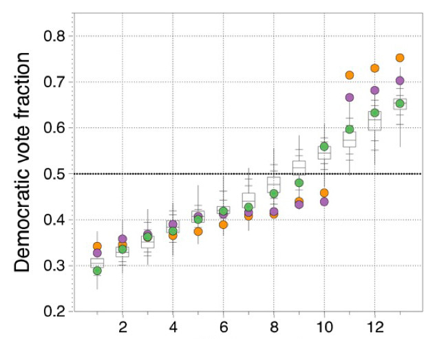
Each box contains 50% of the data, with the central line at the median, the “whiskers” extend to the minimum and maximum values, and the tic marks are at 97.5%, 90%, 10%, and 2.5%.
From these box plots it is easy to see just how anomalous the 2012 and 2016 maps are compared to the ensemble. The districts numbered 8-10 yield fewer votes for Democrats than almost all of the ensemble maps, and the districts numbered 11-13 yield more votes for Democrats than essentially all of the ensemble maps.
The point is that maps like the 2012 and 2016 maps don’t happen by chance — they are extremely rare in the ensemble — they were drawn specifically to affect election outcomes.
Towards a Win-Win
A win-win has to be good for everyone involved. Gerrymandering is not a Democrats vs. Republicans issue. We’ve seen that both parties gerrymander when they have the chance. Incumbent politicians with the power to draw district maps fight to keep that power. In states that have established alternate ways to draw maps (e.g., independent commissions), the power to draw maps had to be wrested from the politicians through ballot initiatives5.
Incumbent politicians in power won’t easily give up their gerrymandering power unless they receive something important in return.
Here’s the deal I would propose to them: State legislatures draw (gerrymandered) district maps. There will be a limit on how much partisan bias the maps may have, and the maps must comply with the Voting Rights Act’s requirements about racial equity, but otherwise, legislators hold the power of drawing the maps.
Here are the benefits to the party currently in control:
They get to draw maps that include some bias in the party’s favor, without the threat of endless court battles about partisan gerrymandering.
Less odious gerrymandering will reduce or even eliminate the pressure to take redistricting power away from state legislatures and give it to independent commissions or judicial panels.
They continue to be able to use districting decisions to reward or punish particular legislators (e.g., double bunking6).
If the party eventually loses power (as often happens over time), it will be protected against extreme gerrymandering by the other party.
The party not in control benefits from the limits on how much partisan bias can be in the maps, making it more likely to be able to turn future changes in voter sentiment into electoral victories.
The big winners are the voters: Instead of engaging in politics in a rigged system, where the outcome of most elections is predetermined by the maps, votes will matter more. With votes mattering more, their representatives will be more responsive to voters needs and views. The maps might still have some bias, but election results will shift as voter sentiment shifts.
This is a win-win-win across the party in power, the party not in power, and voters.
How Could This Work?
The ensemble method provides a bias-free way to evaluate proposed maps. The details would have to be defined by the experts, but I imagine it would work something like this:
Experts would provide computer programs that implement the ensemble method, including respecting legal criteria that a state may have established about compactness, respect for political boundaries (e.g., county boundaries), and adherence to the Voting Rights Act. The source code for those programs would be available for public inspection and the only data given to the program would be past election results. Other experts could verify that the ensembles have been correctly produced.
The legislature would propose a map using whatever means and information they chose. The map would be evaluated against the ensemble. The map would be acceptable if the map’s “dot” on the box plot for each district falls within the box, meaning that the map defines districts that are most typical — they fall within the middle 50% of each district’s ensemble histogram. This requirement would allow some bias in the map, but would prohibit egregious gerrymandering like we’ve seen in the maps in North Carolina and other states.
Importantly, we don’t need to agree what a “fair” map is, how the legislators construct the maps, what information they can or can not use to construct the maps, or any other subjective criteria.
Why Not Have a Computer Program Create the Map?
You might wonder why not just have a program draw the “best” map. The reason is that thoughtful people can easily disagree on what’s “best”. Are maps with the most compact districts preferred; or ones that respect natural boundaries like rivers and mountains; or ones that respect political boundaries like city and county lines; or informal community boundaries?
As Republicans have argued in suits trying to strike down independent commissions, redistricting is inherently a political process. Legislatures are the way that we resolve political issues. Let them do so within the confines of ensuring that the maps they produce are not too biased.
I’m using the word “precinct” to mean small polling areas. The Census Bureau uses the generic term voting district (VTD). Other similar terms are election district and ward. There are many details about how VTDs are defined and related to elections.
Different states have different criteria. North Carolina, for example, defines equal population to be within 5%, which is a lot of wiggle room.
There’s nothing magic about this particular race. It’s a good example for which I already have some graphs at hand.
I stole the title for this section from the title of a paper published by Professor Jonathan Mattingly and his team at Duke University.
Placing two incumbents in the same district in the new maps.


Lee,
Your proposal is intriguing, and I'm always in favor of seeking win-win situations.
But ... I suspect that legislators who currently have the power to gerrymander outrageously won't be willing to settle for the power to gerrymander just a little bit.
I suspect that they will gladly fight in court to preserve their power. And if somehow they're forced to use independent commissions, they'll do their best to stack those. And they won't worry about the possibility that sometime in the future the other side will prevail and gerrymander against them.
(Did Mitch McConnell hold back on stacking the Supreme Court because he worried that the Democrats would someday be in power and do the same? No---he used his power when he had it.)
In other words, won't the legislators who are in the majority see this as a lose-win situation for them?
I would agree with this if the % to which the maps are gerrymandered would be limited to a small %. What would you recommend?