

Economic Anger and Resentment
Why So Many People are Angry About the Economy


Welcome Back to Win-Win Democracy
Growing economic anger and resentment is a threat to our democracy. As many people struggle economically in a land of plenty, they have become angry and resentful, willing to follow populist, authoritarian political leaders who blame others and subvert democratic institutions to consolidate power.
This is not the future; it is now, with descent into fascism increasingly likely if we don’t address the causes of the anger and resentment urgently.
This is the first of several newsletter issues that will be devoted to this topic. Our purpose in this issue is to understand what is happening.
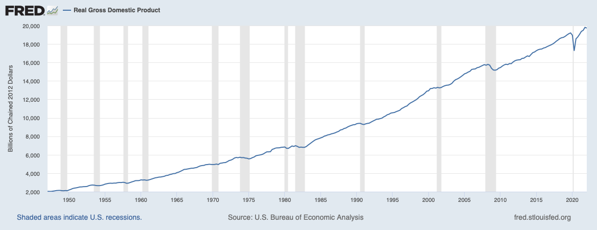
We set the context by observing that United States real (i.e., inflation adjusted) GDP has grown four-fold from 1970 until early 2022:
How has the growth of the overall economy affected people’s income and wealth?
Income
Many analyses of income consider household rather than individual income because there are economies of scale of living together in a household. For example, at any given standard of living, a family of four can live for substantially less than four times the cost of a single person living alone.
We begin by sorting the incomes of all the households in America from lowest to highest, then look at the median, that value in the middle in the sense that half of the households have income below and half above the median1.
Here’s how the median income has changed since 1984:
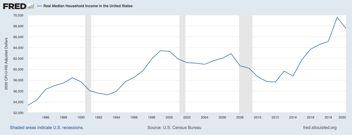
These data are inflation-adjusted into 2020 dollars. During this time period median income grew by a factor of 1.27, while real GDP grew by a factor of 2.6. Inflation-adjusted median income has been growing about half as fast as inflation-adjusted GDP.
Why? First, as we’ve seen previously, since 1980, hourly wage growth of production and non-supervisory workers has been much less than productivity growth. So, only a portion of the benefit of our economic growth has been reflected in increased wages. Second, the way in which overall income growth is distributed affects how the median moved.
Distribution of Income Growth
Berkeley economists Emmanuel Saez and Gabriel Zucman are leading experts in the study of income and wealth inequality. Their work shows that there has been a striking change in how the benefit of our growth is distributed.
To understand their analysis we need to understand the notion of income percentile. It is similar to what we saw in calculating median: sort all of the incomes, but instead of looking for the mid-point, divide them into 100 equal-sized groups, each an income percentile. Saez and Zucman then look at what they call people’s growth, which is the average growth of incomes in each percentile over a period of years:
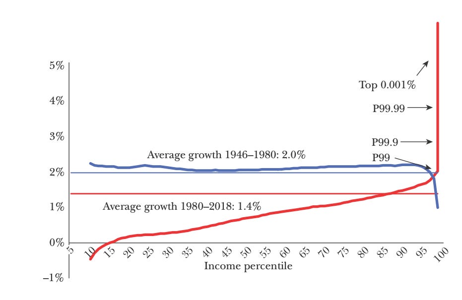
In their words:
“This figure depicts the annual real pre-tax income growth per adult for each percentile in the 1946–1980 period (in blue) and 1980–2018 period (in red). From 1946 to 1980, growth was evenly distributed with all income groups growing at the average 2 percent annual rate (except the top 1 percent which grew slower). From 1980 to 2018, growth has been unevenly distributed with low growth for bottom income groups, mediocre growth for the middle class, and explosive growth at the top.”
As they put it in their 2019 book:
We have changed “from a rising tide that lifts all boats to one that lifts all yachts.”
The Shrinking Middle
Taking a different approach, the Pew Research Center analyzed how the American middle class has been changing in the last 50 years. Their report is worth reading in its entirety; I’ll summarize some of its conclusions.
We first need to understand what Pew considers middle class. Following Pew, we’ll use the phrases “middle class” and “middle income” interchangeably, understanding that here we’re not discussing the social and cultural aspects of class.
Precisely and meaningfully defining middle income is difficult and, to some extent, depends on one’s purpose. The Brookings Institute has discussed this difficulty in detail here and here.
The Pew work uses the following definitions:
Household income is inflation adjusted to 2020 dollars and also adjusted using equivalence scales, which divide the inflation-adjusted household income by the square root of the household size, under the assumption that while costs increase with household size, there are also economies of scale (e.g., a three-bedroom apartment does not cost three times the cost of a one-bedroom apartment). Equivalence-scale-adjusted household income attempts to give a more accurate representation of the quality of life that a household can afford.
Middle income is the range from two-thirds to double of median adjusted household income.
With these definitions, middle income in 2020 was $52,000 to $156,000 annually, scaled for a household of three (the closest whole number to average household size). Lower and upper income are below and above these limits, respectively.
Here’s what has happened over the last fifty years:

The middle class has shrunk while the proportion of upper income households has grown by 7% and the proportion of lower income households has grown by 4%.
Moreover, the median incomes of each of these groups are changing at different rates, with the upper-income group increasing most rapidly:
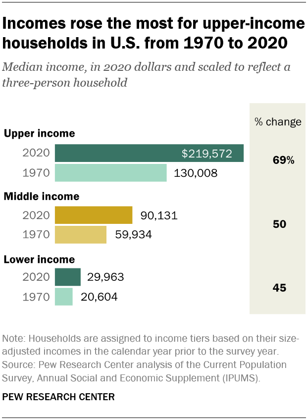
Since upper-income households are experiencing higher income growth, the gap between the upper-income households and the others is increasing.
Indeed, upper income households are getting a larger and growing share of aggregate income, while the middle- and lower-income segments are getting smaller and declining shares:
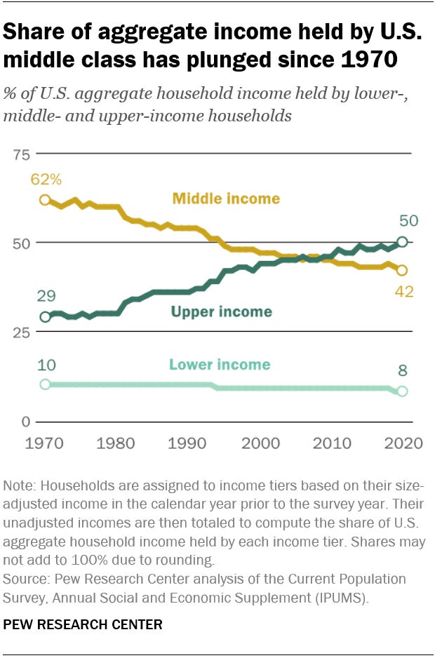
At least part of the decline in aggregate share for the middle income group is because there are fewer households in the group; the situation is worse for the lower-income group, which has both a higher proportion of households and a lower share of income.
Pew’s analysis shows us that the middle is declining and the bottom and top are growing in size, but doesn’t show the size of the income gaps among the various groups. To see this, we need to take a finer-grained look at incomes.
Income Realities
To study income distribution, in their book, Saez and Zucman divide the population into four groups: working class (adults in the bottom half of the distribution), middle class (the next 40%), upper middle class (the next 9%), and rich (top 1%). I will summarize the startling realities about income that they reveal.
In 1980, the rich earned a bit more than 10% of the nation’s income, while the working class earned around 20%. Today, the rich earn more than 20% of the nation’s income and the working class earns 12%. Take this in:
In aggregate, the income earned by the top 1% of adults is 1.7 times as much as the income earned by the 50 times greater number of people in the bottom 50%.
Ignoring the rich for the moment, let’s look at the income of the lower 99%:

It is striking how little income, on average, the members of the working class make ($18,500).
Now let’s add in the rich (top 1%):
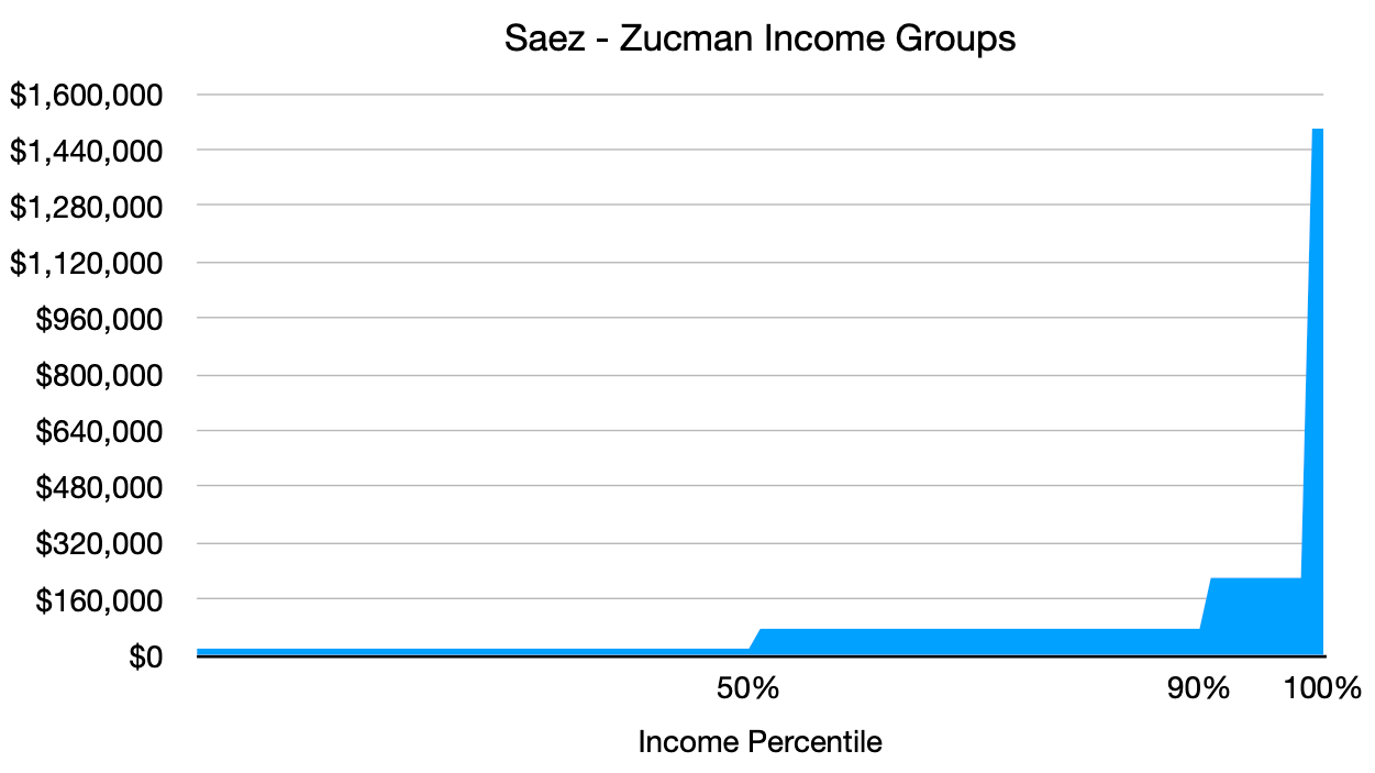
The 2.4 million people in this group are very different from the rest of us!
Wealth
Income is great, but, ahh, wealth. Wealth can be passed along to the kids and families can build it over generations. People without accumulated wealth are vulnerable to the whims of the economy and the vagaries of life.
Wealth is difficult to measure because we don’t tax it directly, so people don’t report it to the IRS.
Nevertheless, economists have developed methods to estimate wealth based on many different sources of information. For example, investment income can be capitalized; in other words, from the investment income reported by taxpayers, the value of certain assets can be estimated2.
The US Federal Reserve publishes quarterly estimates of the aggregate wealth quarterly held by the same percentile groups that Saez and Zucman used, except that these are percentiles by wealth instead of percentiles by income:
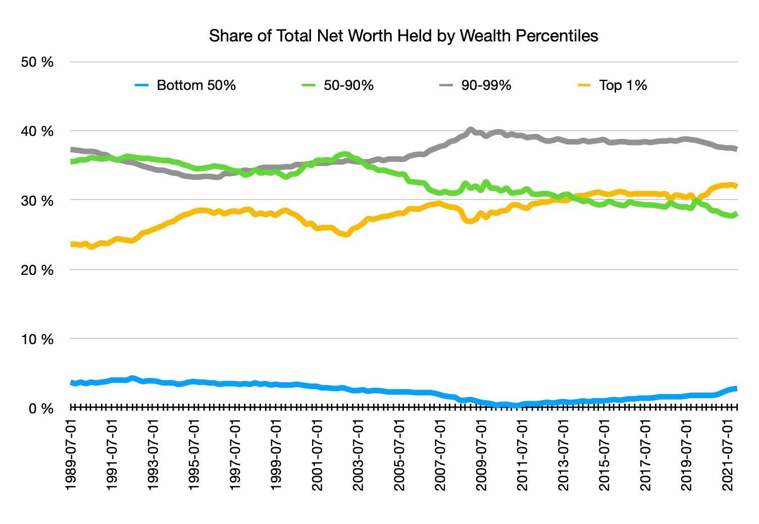
The most striking aspect of this graph is that the adults in the working class (bottom 50%) have almost no wealth. An event that would be a minor inconvenience for people with some wealth can be a financial disaster for people in this group.
Also notice that in the aftermath of the Great Recession, this group had even less wealth; they’ve only slowly been recovering and are not back to where they were before the recession.
People in the working class have been slammed.
Not surprisingly, people in the middle class (50-90%) group have seen their wealth decline in the last two decades, while the wealth of the rich (top 1%) has continued to climb and now surpasses that of the entire middle class.
The upper middle class group (90-99%) owns more of the nation’s wealth than any other group.
Economic Mobility
Maybe none of this matters because America is the land of the American Dream, where the next generation always does better than the current generation. Yes, one might say, my family might be struggling right now, but my kids and their kids will have it better.
It used to be this way, but not nearly as much these days. This graph shows the percentage of children earning more than their parents, by birth year:
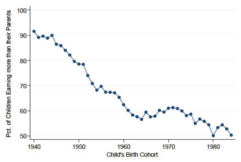
The decline has been precipitous across the country. And, it is worse in some places than in others:
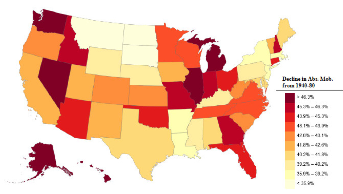
Darker shades correspond to greater decline in mobility since 1940.
The American Dream is a mirage for many families.
Why? There are two major economic trends since the 1940s:
Annual GDP growth has slowed
Income and wealth is distributed much more unequally
Both factors could affect the American Dream. Many analyses and simulations indicate, however, that the shift to a dramatically-skewed distribution of economic growth is the primary culprit.
There are some economists who have found methodological or data problems with these analyses. I’m not competent to be certain that the doubters are wrong. But, certainly, I see strong intuitive rationale to explain why the skewed distribution of income and wealth would help shatter the American Dream — factors like the influence of an expensive educational experience on career earnings, the opportunities created by inherited wealth, etc.
I don’t have the space to elaborate, but philosopher Matthew Stewart has written about this in a long article in The Atlantic in 2018, The 9.9 Percent is the New American Aristocracy3.
Summary
In 2013, my wife and I drove across I-40 from its western end in Barstow, California to Chapel Hill, North Carolina, passing through parts of California, Arizona, New Mexico, Texas, Oklahoma, Arkansas, Tennessee, and North Carolina. We were repeatedly shocked by the economic devastation we saw in places that had apparently once thrived.
The data reinforce what we observed and more:
The middle is shrinking; both lower and upper income groups are growing.
Most Americans earn shockingly little income.
Most Americans have essentially no wealth.
The American Dream is dying for many.
Yet,
Americans in the top 10% of income and wealth are doing better than ever.
In other words, most Americans are struggling, while others are visibly enjoying the good life. Many struggling Americans see no way out of the bottom. And, they’re right. Anger and resentment are natural.
What’s Next?
We now have something of the big picture of how the American economy is actually working for people. Next time: How would we like it to work?
The Census Bureau estimates the median from a sample of households.
If you’re interested in understanding how these estimates are produced, read Saez and Zucman’s 2016 paper on this topic; it is complicated and beyond my limited expertise.
This article was recommended to me by a subscriber to this newsletter. Stewart has also published a book of the same title in 2021. I haven’t read the book.
Curiously, while high percentages of people of people are negative about the economy right now, and feel we are going in the wrong direction, the vast majority are positive about their own prospects. There is also a recent poll, asking people if they were "living the American Dream, or had good prospects to in the near future." Public perception is strange
Using GDP is tricky, and I am not sure they were appropriately used. Part of GDP growth simply reflects a growing population through kids growing up, and immigration, another part is productivity improvement from newer less expensive ways to do things. When looking at an economic activity measure, that might be compared to worker wages, the productivity measure is the one to use., because the income is a per worker measure.
From after WW II, when the playing field had been leveled by federal legislation, and the National Guard was no longer used on strikers, productivity gains, long buses with one driver, automated toll stations, huge coal mining machines, CAD systems for architects and computer logic, were split equally between worker wages and owners. Part of the Reagan Administration agenda was breaking labor unions, done partly by conning non union people, that labor unions were ripping them off. The fact was that union contracts set the standard for similar companies in the same industry, and/or the same type of worker. The recent decades since, have a dramatic shift with worker wages getting a very small share.
Finally, I like to say that the top 0.01% gives the whole top 1% a bad name. Most of the top 1% more like the 9% below it, being just families of two professionals, with bachelors or masters degrees, being teachers, professors, IT Professionals, lawyers (most make less than you think), family practice doctors, Nurse practitioners, Physicians Assistants etc.
So interesting….
Are there any societies in the history of the world that do not perpetuate the ‘have and have not’ socioeconomic mode?
Maybe in small pockets like a Kibbutz?